Color Psychology in Interior Design: Setting the Mood
The Science of Color
Colors trigger emotional and physiological responses. Warm tones stimulate and energize, while cool tones calm and soothe. Understanding these effects gives you a powerful design tool.
Room-by-Room Guide
Living Room
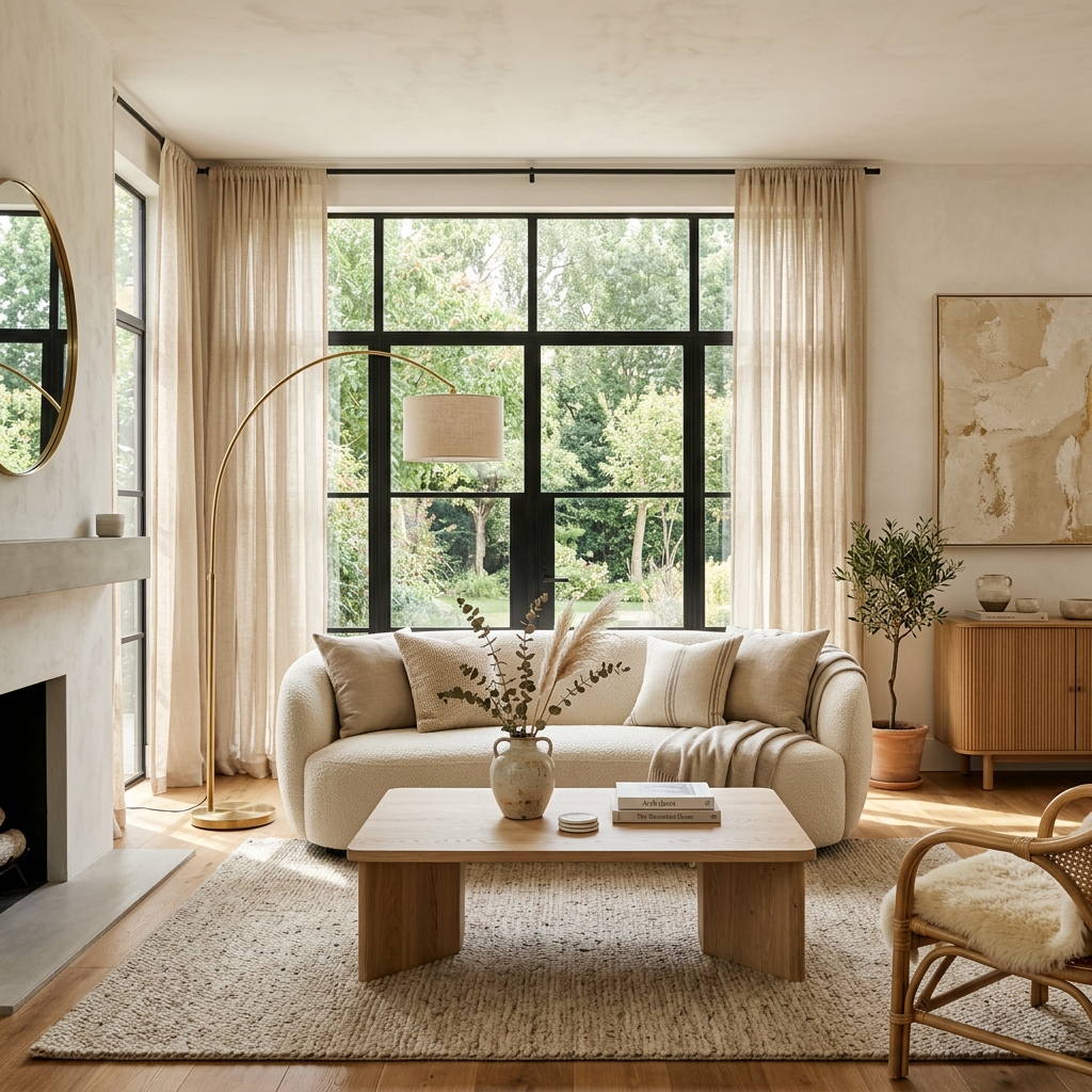
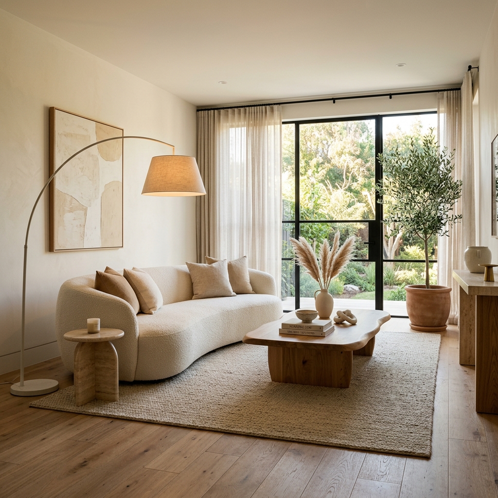
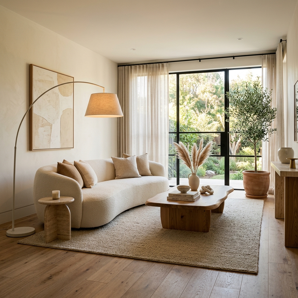
Warm neutrals (cream, beige, soft taupe) create a welcoming backdrop. Layer in accents of terracotta or gold for warmth.
Bedroom
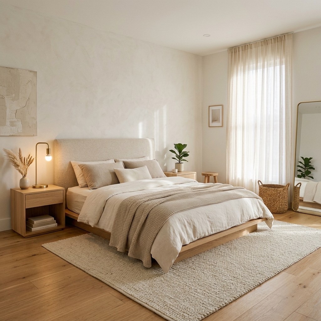
Blues and soft greens promote restful sleep. Avoid stimulating reds or bright yellows.
Kitchen
White and light wood tones feel clean and spacious. Pops of green (plants!) add vitality.
Home Office
Muted blues and greens enhance focus. Avoid pure white — it can feel clinical and cause eye strain.
The 60-30-10 Rule
Use your dominant color for 60% of the room (walls, large furniture), a secondary color for 30% (curtains, accent chairs), and an accent for the final 10% (throw pillows, art, objects).